Dashboard Project
Project Management
- Create a New Project Click [+Create New Project] on the Dashboard Project page to add your own dashboards. A Domain can have up to 1000 projects.
- Edit Project Enter the Dashboard editor to edit a project. You can add, modify, and delete various widgets such as charts, tables, and text boxes.
- Rename Project In the project settings, you can choose to rename a project to better manage and identify different projects.
- Project Permissions Domain Admins and Superusers can view all projects under the Domain on the Dashboard. Domain Admins, Superusers, and project owners can grant different permissions to other users:
- Edit only.
- Edit and publish. Non-project owners can only see the projects they have been authorized to view on the Dashboard.
- Widget access class.
- Copy Project You can choose to copy an existing project to quickly create similar dashboards without having to set them up from the start.
- Backup Project To prevent data loss, you can back up projects. Backup files can be stored locally or in the cloud and restored when needed.
- Delete Project You can choose to delete projects that are no longer needed. Deletion is irreversible, so please proceed with caution.
Operations
Selection and Movement

- Arrow is the default selection tool. Click to select components on the canvas. After selection, you can directly drag to move the component position.
- Hand tool can be used to drag the entire canvas, suitable for quickly browsing different areas when the canvas is large. You can hold the
Space keyto maintain the canvas dragging state without switching tools.
Component Shortcuts
- Copy & Paste: After selecting a component, press
Ctrl + C(Windows) orCmd + C(Mac) to copy, then pressCtrl + V(Windows) orCmd + V(Mac) to paste. - Delete: After selecting a component, press the
Deletekey to delete. - Select All: Press
Ctrl + A(Windows) orCmd + A(Mac) to select all components on the canvas. - Undo & Redo: Press
Ctrl + Z(Windows) orCmd + Z(Mac) to undo, pressCtrl + Y(Windows) orCmd + Y(Mac) to redo.
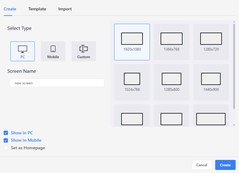
Screen
A dashboard project can include 1 to 50 screens. To support different devices and display requirements, each screen can be configured with its own independent attributes.
Screen Attribute Settings
For each individual screen, the following settings are available:
- Canvas Size: Defines the screen width and height to match specific resolution requirements.
- Device Responsiveness:
Mobile: Indicates that the screen is designed for mobile devices.PC: Indicates that the screen is designed for desktop or widescreen displays. (Note: These tags are used by the system’s automatic device detection logic at project startup.)
Project Startup Screen
At the project level, the system supports automatic startup screen routing based on device type, using the following logic:
Device Routing:
- Different screens can be assigned as the Mobile Home (requires
Mobileenabled) or the PC Home (requiresPCenabled). - When the project loads, the system automatically detects the device type and directs the user to the corresponding home screen.
- Different screens can be assigned as the Mobile Home (requires
Single Entry Fallback:
- If only one home screen type is defined (For example, only a Mobile Home is set, but no PC Home), that screen will be used as the global default entry point. In this case, the same screen is displayed regardless of the device used.
Icons:
- In the Screen List on the left side of the editor, screens designated as a Home screen are marked with a special icon. This allows developers to quickly identify the current startup configuration.
Project Tags
Overview
The project tags allow users to customize calculations like sums and averages, making data usage more flexible and meaningful. This is especially useful in situations where information needs to be processed or summarized, making it more practical than raw sensor values.
Adding a Project Tag
- Click the Project Tags icon in the toolbar.
- A dialog will appear, allowing you to create, edit, and manage expressions and variable mappings. This is where you define your custom calculation logic using data sources.
Defining a Project Tag
When creating a Project Tag, you need to configure the following attributes:
Tag Name A unique name to identify the Project Tag.
Arithmetic Expression Use variables and supported operators or functions to create a formula for calculating results. Variables need to be mapped by setting up variable mappings, linking them to the tag sources.
ℹ️ Please make sure the expression follows the rules described in the Expression Syntax and Format section.
Output Data Type Each Project Tag must specify the output data type, which determines how the result is interpreted. Supported types include: Int, Float, Boolean, String.
Multiplier You can optionally apply a multiplier to scale the result. Available multiplier options include: x1, x10, x100, x1000, x0.1, x0.01, x0.001. This is useful when converting values to different units or scales (e.g., converting seconds to milliseconds).
Decimal Places Set the precision of the final output, with decimal places ranging from 0 to 5. For example, if you use the formula round(x / y, 2) and set the decimal places to 2, the result will be 3.14.
These settings give you fine control over how the result of your expression is presented and used in the system.
Variable Mapping
Only data sources of type Int or Float are supported as valid operands in expressions. Before referencing a data source, you must define variables in the "Variable Mapping" section, linking variable names (such as x, y, z) to specific data sources. Up to 10 variables can be used in each expression, allowing for complex multi-source calculations.
Expression Syntax and Format
Expressions allow you to define formulas that combine numeric variables and functions to compute custom values from data sources.
Basic Rules
- Expressions must be mathematically valid.
- Only the numeric variables defined in the Variable Mapping are permitted, and variable names are case-sensitive.
Operator Precedence (High to Low)
- Parentheses ()
- Multiplication and Division *, /
- Addition and Subtraction +, -
Supported Operators and Functions
- Arithmetic Operators
| Operator | Description | Example | Equivalent Expression |
|---|---|---|---|
+ | Addition | x + y | Adds two numbers |
- | Subtraction | x - y | Subtracts y from x |
* | Multiplication | x * y | Multiplies x and y |
/ | Division | x / y | Divides x by y |
() | Grouping | (x + y) * 2 | Ensures order of operations |
> | Greater than | x > y | True if x is greater than y |
>= | Greater than or equal | x >= y | True if x is greater than or equal to y |
< | Less than | x < y | True if x is less than y |
<= | Less than or equal | x <= y | True if x is less than or equal to y |
== | Equal to | x == y | True if x is equal to y |
!= | Not equal to | x != y | True if x is not equal to y |
- Supported Function
| Function | Description | Example |
|---|---|---|
sum(...) | Returns the total sum | sum(x, y, z) |
mean(...) | Returns the average (mean) value | mean(x, y, z) |
min(...) | Returns the smallest value | min(x, y, z) |
max(...) | Returns the largest value | max(x, y, z) |
round(x, n) | Rounds number x to n decimal places | round(x / y, 2) → 1.23 |
randomInt | Returns a random integer within range | randomInt(1, 10) → 7 |
randomFloat | Returns a random float within range | randomFloat(0, 1) → 0.57 |
randomString | Returns a random string from a list | randomString(['a', 'b', 'c']) → 'b' |
Example Expressions
x + y * 2
(x + y + z) / 3
round(sum(x, y, z) / 3, 2)
max(a, b) - min(c, d)
Expression Validation
When clicking "Add" to create an expression or "Apply" to modify one, the system will parse and validate it. The validation includes:
Unmapped Variables Each variable must be mapped to a valid data source. If a variable is defined but not assigned, validation will fail.
Unknown or Undefined Variables All variables used in the expression (e.g., x, y, z) must be defined in the Variables Mapping section.
Unsupported Functions Only supported functions are allowed: sum, mean, max, min, round, randomInt, randomFloat, randomString. Using any other function will trigger an error.
Other errors e.g., unmatched parentheses
During expression validation, the system checks the above criteria and prompts users to correct any errors. This ensures that the expression is accurate and the calculation results are reliable.
Index
Displays all widgets on the screen. Since widgets can overlap, lower index numbers mean a lower layer. You can change the order by dragging and dropping.
Pattern
Provides basic shapes such as rectangles and ellipses, as well as images and text, along with their property settings.
Replace HMI
The [Replace HMI] feature allows quick replacement of tags within the dashboard. To substitute a tag, both the name and group of the new tag must match the original tag.
Grid and Auxiliary Line
In the Dashboard editor, you can use the icons at the bottom right corner to toggle the display of grid lines and auxiliary lines, making it easier for users to design their projects.
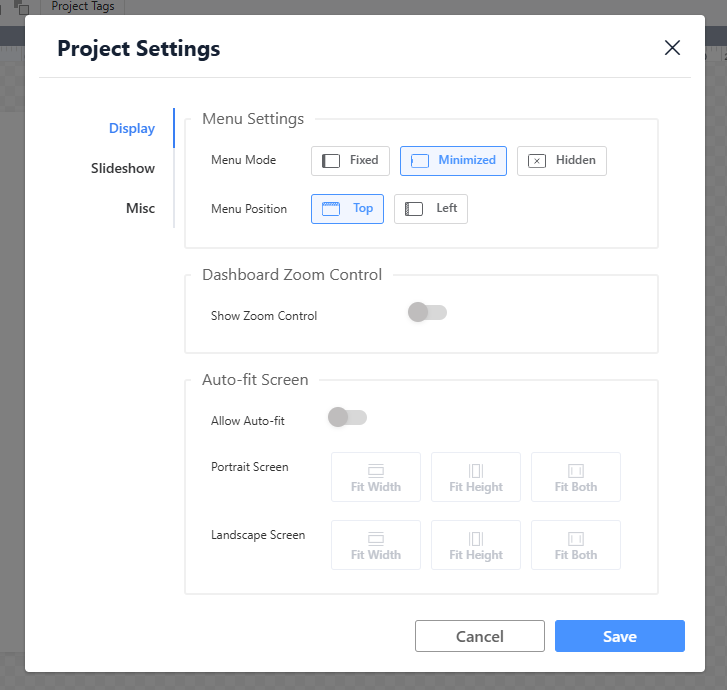
Project Settings
Display Settings
Define how the dashboard is displayed and how users interact with it across different devices and usage scenarios.
- Menu Position:
- Description: Specifies where the main navigation menu (such as screen/slideshow switching, settings, and action buttons) appears on the screen (e.g., top, left sidebar, bottom).
- Benefit: Improves usability on different screen sizes. For example, placing the menu at the top or bottom on smaller devices helps preserve more space for content.
- Zoom Control:
- Description: Enables or disables on-screen zoom buttons (zoom in / zoom out) and allows users to set a default zoom level.
- Benefit: Allows users to adjust content size based on viewing preferences and screen resolution, especially useful for dashboards with detailed charts.
- Automatic Fit Screen:
- Description: Determines whether dashboard content automatically scales and adjusts its layout according to the browser window size.
- Benefit: A key element of Responsive Design. Ensures optimal visual presentation across desktops, tablets, and large displays, while preventing content clipping or excessive blank space.
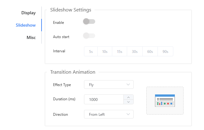
Slideshow Settings
Control automatic screen switching behavior and transition effects between dashboard screens.
- Auto Start:
- Enable/Disable: Determines whether screens switch automatically without user interaction.
- Interval: Sets how many seconds each screen remains visible, allowing precise control of the slideshow pace.
- Transition Animation:
- Effect Type: Selects the visual effect used when switching between screens.
- Duration: Specifies the transition time in milliseconds.
- Direction: Available for certain animation types; defines the movement direction (e.g., left to right, top to bottom).
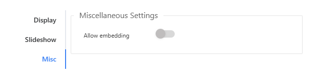
Miscellaneous Settings
Determines whether the dashboard can be embedded into other applications or websites.
Preview
Users can utilize the preview function during the design phase to test the operational execution of the dashboard project.
Publishing
- Custom URL:
- Customize the web address for easier memorization and access.